FED Liquidity & Policy Analysis
Track Federal Reserve balance sheet flows, policy regimes, and economic outlook
Last Update: --
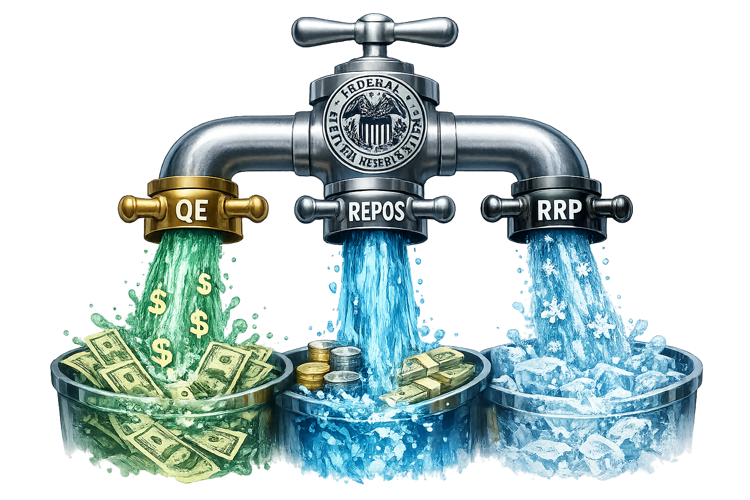
QE (Quantitative Easing)
The Federal Reserve's primary liquidity injection mechanism. The Fed purchases government bonds and mortgage-backed securities from financial institutions, adding fresh money to the system. This expands the Fed's balance sheet (WALCL) and increases market liquidity.
REPOS (Repurchase Agreements)
Short-term liquidity operations for overnight funding. Banks and dealers temporarily sell securities to the Fed with an agreement to repurchase them the next day. This provides temporary liquidity to stabilize short-term interest rates and ensures smooth market functioning.
RRP (Reverse Repo Program)
The liquidity drainage mechanism. Financial institutions park their cash with the Fed overnight, effectively removing money from circulation. High RRP levels indicate excess liquidity in the system that the Fed is sterilizing, reducing the net liquidity available to markets.
Funding Stress Index
Are short-term funding markets calm — or showing stress?
Composite of 5 dollar-funding sub-indicators — measures global USD scarcity and repo / FX-swap stress.
Composite Score
Last update: --Sub-Indicator Breakdown
Each component's z-score (5y rolling) and contributionFED Phase
Balance sheet sets the direction, rates set the speed as of --Money Flow Visualization
Where is the FED's money coming from — and where is it going?
Today's Money Flow in Plain Words
Loading...
FED Policy Stance
Economic Outlook
Rate Expectations — next FOMC meetings
Real-time Federal Reserve liquidity flows between institutions.
Formula: Net Liquidity = WALCL (FED Assets) - TGA (Treasury Account) - RRP (Reverse Repo)
Arrow thickness represents flow strength. Green = liquidity injection, Red = liquidity drainage.
Historical Liquidity Analysis
Is the FED net adding liquidity to the system — or draining it?
Track Federal Reserve balance sheet flows, net liquidity, and economic indicators over time.


Chart Panes
Pane 1: SPY with Net Liquidity Level (WALCL - TGA - RRP)
Pane 2 – Fed B/S: Fed components (WALCL / TGA / RRP)
Pane 3 – Liq/M2: Net Liquidity / M2 Money Supply (%)
Pane 4 – Liq Flow: Net Liquidity Flow (4-week change, z-score)
Pane 5 – Macro: Industrial Production YoY, CPI YoY, Unemployment change
Panes 2–5 switch on and off with the buttons in the chart toolbar.
Yield Outlook
What does the bond market expect the FED to do over the next 3 years?
Effective Fed Funds Rate history with a 36-month forecast. Up to the last FOMC meeting the Fed funds futures strip reaches (about 15 months), the forecast steps meeting by meeting to the futures-implied rate — the same path as the header chart above; beyond that it follows Treasury forward rates (UST 1Y/2Y/3Y). The rate path is classified into four regimes — Hike (orange), Hold High (red), Cut (light green), Hold Low (green) — which also color the SPY candles in Pane 1. The yellow band around the forecast is a ±1σ uncertainty envelope that widens with the horizon (≈ ±25 bp at 1m, ±80 bp at 12m, ±140 bp at 36m).
2·y(2n) − y(n) from the Treasury curve.
FOMC Dot Plot
Where do the FED's own members think rates will land?
The FOMC's Summary of Economic Projections (SEP), released 4× / year after the March, June, September, and December meetings. Each meeting produces a "dot plot" — every FOMC participant submits their projection for the appropriate end-of-year federal funds rate over the current year, the next 2–3 years, and the longer run. The chart shows the median (green dot), the central tendency (the middle bunch after trimming the extremes), and the full range across participants. Step through history with the buttons or the keyboard arrow keys to see how the committee's rate path has shifted between meetings.
LR-suffixed longer-run variants), reconstructed per-vintage
from each SEP release. Individual anonymized dots are graphical in the
Fed's PDF and not redistributed here.
Net Money Flow Composite
Is real money flowing into equities — or quietly stepping away?
A single Z-scored index combining the direct flow signals that drive equity prices independent of headline Fed liquidity: FINRA margin debt growth, TIC foreign treasury & equity flows, money-market fund rotation, ETF flows, corporate buybacks, and insider net buying. Pane 1 shows the composite (positive = net inflow to equities). Pane 2 layers the Bond/Stock allocation drivers — 10Y Real Yield (TIPS), equity earnings yield, and the Equity Risk Premium that is the difference. Pane 3 decomposes today's composite into its component Z-scores so you can see which flow is carrying the signal and which is dissenting.
Liquidity Regime & Foreign Capital Flows
Is foreign capital pulling money into US assets — or pushing it back out?
Pane 1 — SPY candles: S&P 500 ETF as the equity reference,
colored by the Effective Liquidity Regime from the WALCL/TGA/RRP composite —
Expansion (liquidity expanding),
Transition (neutral),
Stress (liquidity contracting).
This makes the "liquidity drives equities" thesis directly readable: green candles cluster
with rallies, orange candles with corrections. Mismatches (e.g. SPY rallying during Stress)
flag risk-on euphoria without liquidity backing.
Pane 2 — Quarterly flow histogram:
Green bar = foreign capital flowing
INTO US Treasuries that quarter;
red = flowing OUT.
Bar height in USD billions.
Pane 3 — Absolute level of foreign official Treasury holdings in USD trillions
— secular trend context. Source: Fed Z.1 Flow of Funds (BOGZ1FL263061130Q), quarterly.
Effective Liquidity Model
Domestic: zFED - zTGA - zRRP - zREPO
External: -zSWAP - zFOREIGN - zUSD
Effective Score: Domestic + External
Regime: >+1 Expansion | <-1 Stress | else Transition
■ Expansion → Risk On
■ Transition → Selective
■ Stress → Defensive
Federal Reserve Economic Data (FRED)
Browse the raw FED data feeding every chart above — pick a series and see it directly.
Liquidity Analysis Guide
Understanding FED Flows
- WALCL: Total FED assets. Rising = QE (expansion), Falling = QT (contraction)
- TGA: Treasury's checking account. Rising = drains liquidity from markets
- RRP: Reverse repo facility. Rising = sterilizes liquidity (parked cash)
- Net Liquidity: What actually reaches markets (WALCL - TGA - RRP)
Policy Regimes
- QE/EXPAND: FED buying assets (gross flow Z > +0.5)
- QT/CONTRACT: FED selling assets (gross flow Z < -0.5)
- EASING: Net liquidity rising and above trend
- TIGHTENING: Net liquidity falling and below trend
Economic Outlook States
- GOLDILOCKS: Strong growth + Low inflation (ideal)
- OVERHEAT: Strong growth + High inflation (FED tightens)
- DISINFLATION: Weak growth + Low inflation (FED eases)
- STAGFLATION: Weak growth + High inflation (FED dilemma)
Risk Indicators
- Inverted Curve: 10Y-2Y yield < 0 (classic warning)
- Tightening Liquidity: Net level falling and below trend
- Low Liquidity Ratio: Net Liq / M2 declining below historical average
- Weak Growth: INDPRO, Payrolls slowing
- Labor Weakening: Rising unemployment, rising claims
The Dollar's Impact on Liquidity and Equity Markets
Strong Dollar – Liquidity Headwind
The U.S. dollar does not create liquidity — it determines how effectively liquidity works. When the dollar strengthens, global capital tends to seek safety in USD cash and reserves. As a result, liquidity leaks out of risk assets, even if the Federal Reserve is injecting money into the system. This often weakens the transmission of monetary easing to equity markets.
Weak Dollar – Liquidity Tailwind
When the dollar weakens, funding stress eases and capital flows back into risk assets. Liquidity circulates more efficiently, supporting higher equity valuations and more stable market trends. In this way, the dollar acts as a gatekeeper: it does not change the amount of liquidity, but it controls where and how strongly that liquidity impacts markets.