Connections
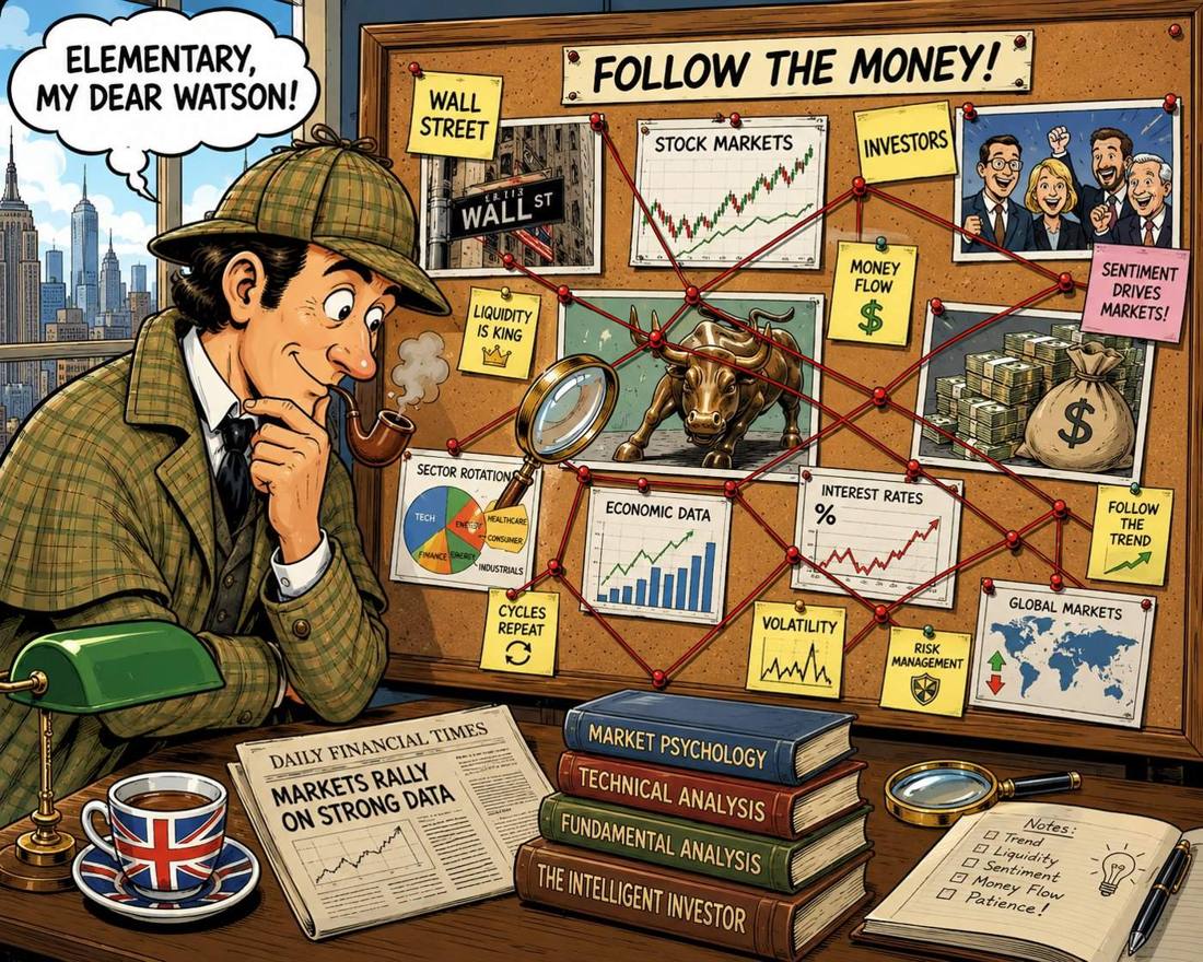
Some days a lot of the market changes character at once — sectors turn, insiders start buying, trading moves off-exchange, short positions unwind. This page looks for those moments and for the groups of companies caught up in them, and asks one question of everything it finds: is this more than would happen anyway?
This is the whole idea, and also its limit. A detective’s board is a set of things that turned up together, joined by string. The string is not evidence of a plot — it is a record of what the detective noticed, and most of it will turn out to have a dull explanation.
That is exactly what this page is. Every red line below was measured: two companies moved together far more than their industry did, the same insider filed at both, their off-exchange trading rose and fell in step. What no line can tell you is why. The board says here, look — the looking is still yours to do.
This page shows that things happened together more often than usual. It does not show collusion, inside information or manipulation, and it never claims to. Things happening together usually have a dull explanation — the whole market moved, the sector moved, it was a rebalancing day — and we strip those out before showing anything. What is left is a place worth a closer look, not a conclusion.
How unusual is this day?
We track about 470 separate signals across the market. Each is normally steady and only occasionally flips into a different character. The colour of the candles below says how many flipped that day — and which way they went.

How much changed today
Zero is a normal day. The higher the line, the more parts of the market shifted at the same time. One honest caveat: these signals are related to each other, so some always move together. Read this as the most that could be called unusual, not the least.
Two extras under “Show”
The raw count — how many signals actually
moved, next to how many normally do — used to have a pane of its own. It
drew the same curve: within any period it tracks the line above almost exactly,
differing only because the count drifts as we add signals, which is the very
thing the score removes. It is still there as an overlay for anyone who wants
to check one against the other.
Share of signals reporting answers “was anything missing?”.
Days when the US market was shut are removed entirely rather than smoothed
over, so no gap is disguised as a value. It is off by default because the
answer is almost always “no”.
The nine market regimes
show / hide
Two things describe a day: how much of the market changed character, and which way it changed. Neither alone is enough — a lot of movement is one thing when it is constructive and quite another when it is not. The two together make nine states, and each has a track record:
The candles — market regime
The S&P 500, coloured by the state the market was in that day. The shade says how much was changing — muted when little was, vivid when a lot was. The colour says which way: red when more signals were turning weaker, green when more were turning stronger, yellow when neither side led. Nine states in all; what each has meant is in the table below.
Every flip has a direction: a signal can turn stronger or weaker. We take the direction from where each signal ended up, never from what the market did that day — otherwise we would simply be reading the price back to you and calling it a finding. 455 of our 467 signals have a clear stronger/weaker meaning. The rest are yield-curve signals, where the same move can be good or bad news depending on why it happened; those sit out. The ordering is clean: on days our signals turned stronger the market rose six times out of ten; on days they turned weaker, fewer than five.
But it tells you nothing about tomorrow. We checked what the S&P did over the next day, week, month and quarter after each kind of day. The answer every time was: the same as after any other day. Splitting it further by how turbulent the day was does not help either.
That is what we expected, and it is worth being plain about why. These signals are built from prices, so they describe what is happening now — they cannot know something the price does not already show. Use this to understand the day you are looking at, not to anticipate the next one.
Where it goes next
Every day in today's state, and where the next day went. Each figure sits next to its base rate — the share of all days that end in that state — because a probability on its own cannot be read. A 27 % chance is worth nothing when 27 % of all days are that state; what matters is the gap between the two.
Did it show up when it mattered?
show / hide
The Board
How to read the boardshow / hide
The companies in one industry. A red line means two of them have been moving
together far more than the rest of their industry does — thicker for a tighter
link. A blue dashed line means the same company insider trades at both; an
amber dashed line, the same legislator. Those are facts about people, not
patterns in prices, and no correlation could ever find them.
A cyan dashed line is different again: those two names see their
off-exchange trading rise and fall together. That is measured on volume, not
on price, so it can connect two companies whose share prices show nothing.
The shaded background is the industry itself — we do not draw a line for
“same industry”, or every company would be joined to every other and the
picture would say nothing. A company sitting alone with no line is information:
nothing in its own industry is moving with it.
Hover any name to see its details and light up the whole cluster it belongs
to — direct links stay bright, the rest of the cluster stays legible, everything
unconnected fades. Click to load it into the chart. On a touch screen the first
tap shows the details and a second tap on the same name charts it.
Companies or Industries. Both draw the same board. Companies keeps to what
happens inside the industry; Industries adds the margin that shows where this
board’s links go outside it, and which of its names carry them. Use the narrower
one when the question is about this industry, the wider one when it is about the
industry’s place.
Connections switches each kind of link on and off on its own, because a price
correlation, an off-exchange one, a shared insider and a shared legislator are four
different claims and following one of them through the other three is hard.
Money flows is the only line here with a direction: an arrow runs from the
position an institution CUT last quarter to the one it ADDED, one arrow per
institution, from its largest cut to its largest add. Its width is how many
institutions made the same rotation — never how much money, which the
quarterly filings do not give us.
Then click a line. Most links have an ordinary explanation you can usually name once you see the two companies together: the same customer, the same commodity, the same regulation. That is the point — the board shows you where to look, and the looking is still your job. It is not a buy or sell signal.
Side by side — …
Double-click a line on the board and both companies it joins appear here,
drawn as per cent moved since the start of the window — which is the only way
two prices at $180 and $3 can be compared at all. Clicking any name, or any row in
any table on this page, puts that one here on its own; the
↑ / ↓ keys then walk down a table without moving the
page, so you can flick through a list and watch the lines change.
The markers are the other half of the story. An arrow up is a buy and an
arrow down a sell; blue is a company insider and amber a
legislator, the same two colours the board uses. A circle on the line is a
week of unusually heavy off-exchange trading — measured against that
company’s own normal, because a 6 % off-exchange share is ordinary for a
mega-cap and remarkable for a micro-cap.
Distributed anomaly by industry
When a large investor builds a position across a whole industry, it rarely shows up the same way in every company — one name shows heavy off-exchange trading, another unusual volume, a third an insider buying. Looking for all the signs in one company misses it. So instead we ask: how much of this industry looks unusual in any way at all? If far more of it than normal does, that is worth a look. Click a row to see that industry's board.
Industry or sector. The switch above changes every table in this part of the page. The sector view is not the industry numbers added up — it is the same test run again with sectors as the groups, because a probability cannot be added and a percentile cannot be averaged. Expect fewer things to stand out there: a sector is so large that it is close to the market by definition, so a real move inside one industry gets diluted by the twenty around it. In the sector view, click a row to drop back to the industries inside it.
When a group stops moving as one
Not one company against its peers, but the whole group against its own past — biotech is naturally scattered, regulated utilities move as one, so “unusual” can only mean unusual for that group. Sectors come apart far less often than industries do, because a sector is a mixture of industries that each have their own reasons to move. When a group does split, half its companies go one way and half the other — usually along a line that appears in no official classification, like who sells into China or who has debt to refinance. The bar shows how far apart the two camps have moved, but the useful part is who ended up in which camp; click a name to chart it. Separation is scored per row on its own colour scale, printed at the ends of its bar — one shared scale left every row but the widest as two near-identical shades, so compare colours within a row and use the percentage-point gap beside the name to compare between rows.
First, the sectors
When an industry splits into two camps
Rhythm and clustering
Someone working through a large position over weeks leaves a rhythm — trades arriving on a regular schedule. Random buying and selling does not do that. Here we look for companies where that rhythm shows up at the same time as several of the company's own insiders trading the same way.
People who link names
Directors and executives often sit at more than one company. When the same person is trading at several of them, that connects those companies through a person rather than through their share prices — something no amount of chart analysis would reveal. Everything here comes from public filings of the last twelve months.
What this page cannot tell you
The dull explanations we rule out first
Shares move together all the time — that is what a market is. Anyone looking for “things moving together” finds something every single day and is perfectly correct: what they have found is the stock market. So before anything reaches this page we take away the ordinary reasons, in this order:
- The market went up or down. Removed first, always.
- The sector went up or down. Removed next.
- It was that kind of day. Index rebalancing days, option expiry, quarter-end — real, large, and completely harmless.
- Someone bought the index, not the company. When a fund buys a whole basket, every name in it moves; that is mechanics, not a view on any of them.
- Something happened. Earnings, an index addition, a takeover.
- Nothing above explains it. Only this last group is worth your time.
We can only fully check the fourth one for today, because we hold company sizes as a snapshot rather than a history, and we do not have fund holdings at all. Where we cannot check something, the page says so instead of quietly leaving it out.